
I take a lot of photos, and I have a long standing love of data visualization, so it was natural to want to combine them eventually - especially as I now have Lightroom catalogs for photos stretching back to 2002, when I got my first digital camera.
Everything is SQL
Lightroom catalogs (the .lrcat file) are actually just
sqlite databases, which makes them
incredibly easy to analyze if you know a little SQL. A few simple
queries can give you distribution of shots taken by day (or whatever
time period you like), by aperture, focal length, or really any photo
metadata that your camera(s) capture.
For example, here's a query to show the distribution of photos taken by aperture value.
SELECT   aperture,
         count(aperture) as count
FROM     AgHarvestedExifMetadata
WHERE    aperture is not null
GROUP BY aperture
ORDER BY aperture
Which outputs data that looks like this
aperture   count
---------- -----
1.695994   79
2          10
2.275007   6
etc...
With a little reverse-engineering of the database schema (it's a pretty straightforward schema), it's trivial to take that general pattern and extract distributions on whatever attribute you like - focal length, shutter speed, date, etc...
EXIF and APEX
An interesting side note is that the aperture value in EXIF is stored in the APEX (Additive system of Photographic EXposure) system, a logarithmic system designed to simplify exposure computation. It's now largely forgotten, unless you happen to be writing software that processes EXIF data. To get the more familiar f-number, you take the base-two exponent of the aperture value divided by two.
Heatmap Visualization
If you use Github, they've made the heat map visualization popular with a display of daily commits on everyone's profile page.
Here's what I shot on my Micro Four Thirds gear in 2015. Each grid cell represents one day, with weeks organized vertically - so what you see here is week-by-week activity, running from January on the left to December on the right. This mostly reflects two big trips, to New Zealand in the spring, and East Africa in the fall.
And here's what I shot on my iPhone during the same time frame - clearly, the convenience of the phone has trumped even the small M43 gear for daily shooting. Although, I have been carrying my "real" camera around a lot more since getting the OM-D EM5 Mark II.
2003-2015
And of course, what's the good of having over a decade's worth of data if you can't plot all those years at once? Again, this is exclusive of iPhone shots. One thing is clear - September is our favorite month for travel.
Note the totals for 2015 - the distribution is fairly sparse, but we shot 39,411 exposures in across 2 M43 bodies and a Canon point and shoot. That's what happens when you go to New Zealand for 3 weeks and then Africa for two!
Sunburst Visualization
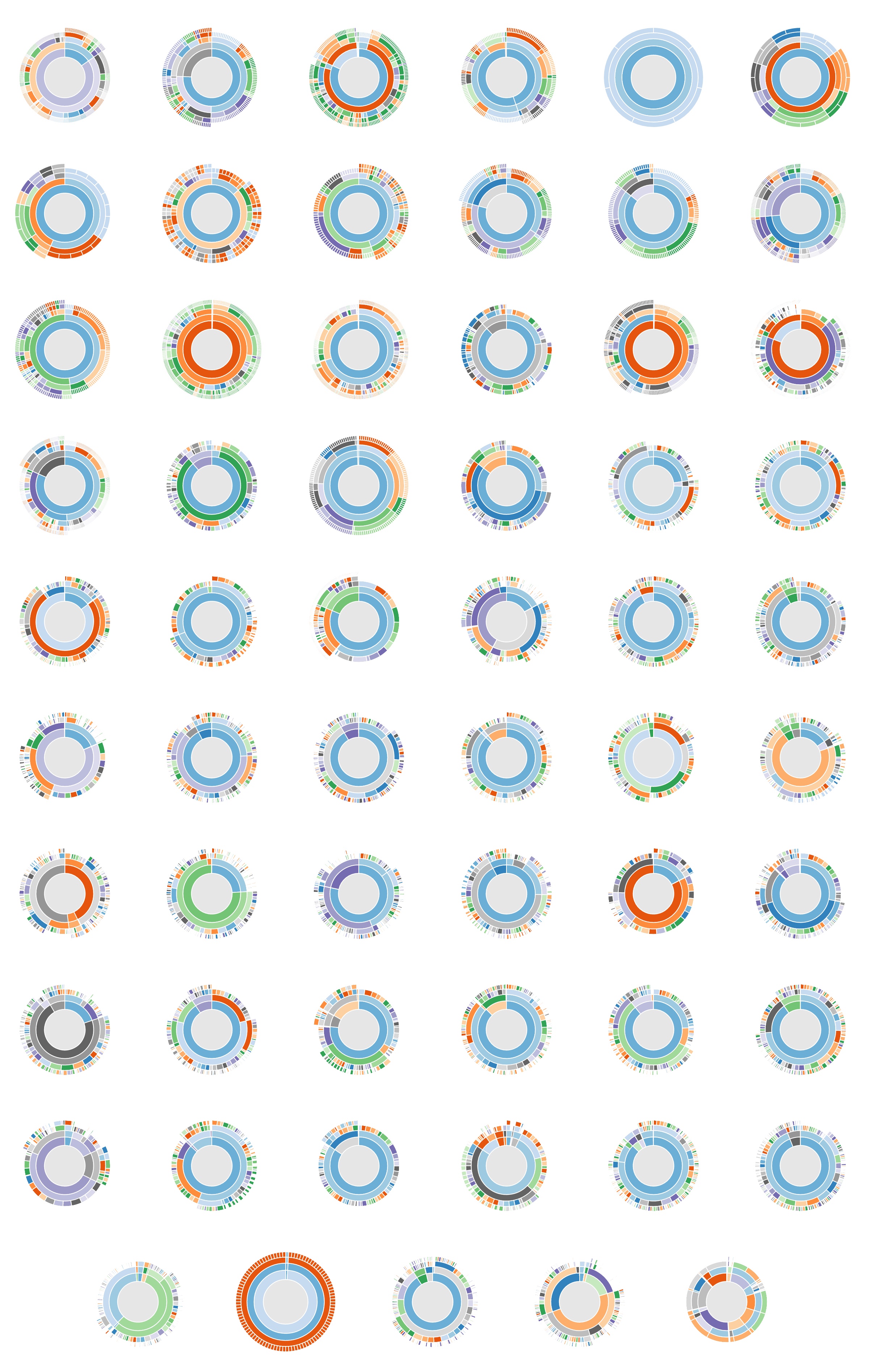
Another visualization I'm fond of is the Sunburst, which is like a radial treemap (see also the d3 sunburst examples). It's a good way of presenting hierarchical datasets, and it just plain looks cool.
This sunburst presents distributions of number of shots taken categorized first by camera, then by lens. If the lens is a zoom, the next level is focal length - for prime lenses the chart goes straight to aperture (by f-number, not APEX value) and exposure time. It's interactive - click on a segment to zoom in, click in the center to zoom out.
I'm using nvd3 for rendering the sunburst - it's a Javascript library built on top of d3 that I initially used for the client-side charts in Tessera. It added an implementation of sunburst charts in early 2015, and it lets you concentrate on futzing with getting the data into the right format, rather than rendering.
This is all it takes to create one of them (the remaining complexity
here is in the transmogrify function that sets up the data).
function sunburst(selector, catalog) {
  var data = transmogrify(catalog)
  var chart
  nv.addGraph(function() {
    chart = nv.models.sunburstChart()
      .color(d3.scale.category20c())
    d3.select(selector)
      .datum(data)
      .call(chart)
    return chart
  })
}
This example - bl.ocks.org: Sequences sunburst shows a really cool interaction that would be great to integrate. Some day, maybe.
Like the 12 years of heatmaps above, grouping sunburst charts together is interesting, to see the different patterns in different catalogs, or the way different parameters are grouped in a single catalog.
This image below presents the same hierarchy above (Camera -> Lens -> Focal Length -> Aperture -> Exposure time) for every Lightroom catalog I currently have (rather than have one massive catalog, as some people do, I keep a separate catalog per year, and additionally a separate catalog per trip). This one's just a static screenshot, as the raw data to produce it is about 350MB of JSON.
Source Code
The analysis code I used to produce these visualizations is written in Go, and is available on Github.
I will eventually be turning this into a tool to generate standalone reports on individual Lightroom catalogs, but I have to balance that with actually editing the accumulated photos themselves, which I'm about five years behind on.... (and the current javascript code to munge the raw data for these is an ugly, quick hack).
The sunburst visualization is a chart provided by nvd3, which provides reusable charts on top of d3. The heatmap visualization is rendered by cal-heatmap.